Never mind a picture being worth a thousand words. This one chart, from The Economist, is ostensibly about various nations’ percentage share of the world economy through the last 2,000 years. But look more deeply, and the chart will effectively tell you half the history of the world. The collapse of the Roman Empire shows up in the decline in Italy’s share of GDP between 1 and 1000 AD; the Industrial Revolution and eventually the rise of the United States show up in the explosion in the West’s share of GDP after 1820. And plenty of ink has been spilled about the resurgence in the share of GDP accounted for by China and India, after 1970; our most recent reminder came in the form of this week’s meeting between the leaders of Brazil, Russia, India and China – the “BRICsâ€.
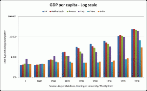
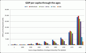
The other half of history, I think, can be represented by the absolute level of GDP per capita. I have used the late Professor Maddison’s data (which you can find on his home page) to create these two charts:
The first (log 10 chart) is better at showing up the differences within the earlier period, while the latter is better at showing the sheer magnitude of the transformation of human life in the last 200 years.
This all begs the question, “Why?†Why did nations industrialise, and why did some do so faster than others? This is one of those topics where I know just enough to realise that, in fact, I don’t know a lot – there is a tremendous amount of scholarship in the field, of which I have just been able to scratch the surface. Nevertheless, over coming weeks and months,  I plan to post reviews of books by various authors who attempt to answer that question.
I look forward to exploring these ideas with you.


